How I built this site
Five days, about 500 messages, most of them typed on my phone, and a chrome head with opinions. This is what actually happened, including the parts that didn’t work.

Adam Perlis
October 2026 · about 18 minutes
- 5
- days, 15 to 20 October 2026
- 527
- messages, most typed on my phone
- 150+
- commits
- 78
- entries in the build log
I didn’t write the code for this site. I wrote messages.
Claude Code wrote the code, ran it, opened it in a browser, took screenshots, and showed me. I told it what was wrong, usually in one line, typed fast on my phone. What I brought was taste, references, and a lot of no.
On the first evening I asked it to keep a log of everything, because I knew I’d want to write this. The log ended up over 4,100 lines long: every message I sent, word for word, what changed and why. Everything below comes from it. The before-and-after screens are the site’s own old versions, rebuilt from git and photographed.
It started with one plain message
No moodboard, no brief. The first thing I typed, on a Thursday evening, was this:
i want to create a new project for my personal portfolio / website. can you get this added to github and help us get started.
Claude checked my GitHub and found the obvious names, adamperlis.com and portfolio, already taken by repos of mine from 2015 and 2017. It asked me three questions: a name, a stack, public or private. I answered adamperlis-2026, Astro and Tailwind, private. Then:
gonna host this on cloudflare
Twelve minutes after that first message, an empty site was scaffolded and pushed to a private repo. Only then did I show it what I wanted it to feel like.
Then the references
Two motion reels I’d saved from X, and one sentence:
study the style of this i want my website to look and feel just like it. look at the fonts, architecture, hierarchy, layout, animations, movement.
Claude downloaded the full-resolution videos, stepped through them frame by frame, sampled the colours and wrote a design brief from what it found. A reel told it more in a minute than I could have in a page.
After that came a burst of short messages, one after another: the GitHub repo for the glass carousel in those reels, then my old site to take the copy from. And then the actual point of the thing:
I think the goal is for folks to approach me about consulting and helping them build their apps.
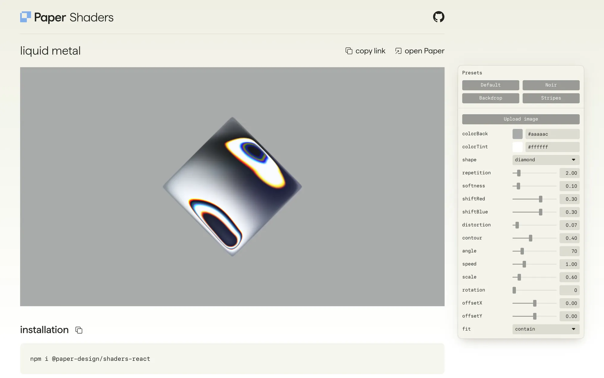
That one line decided the whole site. My apps and my open-source skills stopped being a portfolio and became proof. A few messages later came Paper’s liquid metal for the shader, and an idea for the front door:
let’s have subtle nods to all my vibe coding skills… like maybe the site hero requires the user to hit enter on npx start @adamperlis
Two more lines set the bar and the paper trail:
the site should feel cinematic like a motion graphics reel would
let’s make sure we document all the steps along the way that i am building this. i want to publish an article later about it. so like we should document prompts, changes i make, directions i give, should summarize in bulk like every 30 minutes of work or so.
Forty minutes after the first message there was a working site: a terminal at the front door typing npx start @adamperlis and a glass carousel of my apps. Within the hour, agents had drafted eleven case studies from my repos’ READMEs.
A starting point, not a template
None of this was copied to the letter, and copying was never the point. The reels and sites I sent were where it started, not what it became. From Basit’s reels I took a feeling: open white space, small type, things that move with weight. From jib.design, a gray mat for screenshots. From Paper, a shader. From Edo’s reel, a rhythm to cut to. From David O’Reilly, a small, kind character.
Everything built on top of that is mine: a terminal at the front door that melts into a chrome guide, a ball that sings my client list, a dial that spins through it, Buddy’s voice and his jokes. Put any of the references next to the site and the end results are very different. Borrow the feeling, then make it yours.
The first version looked like a template
It was a stack of cards on warm grey, and it looked like a thousand other sites. An hour in, I asked for the opposite:
i want to refactor the site a bit and not rely on these cards so much. want them to be more open and let each of these moments breathe
Then, in quick succession: “use a white bg.” “the site should have really minimal vibes to it.” “use lots of white space.”
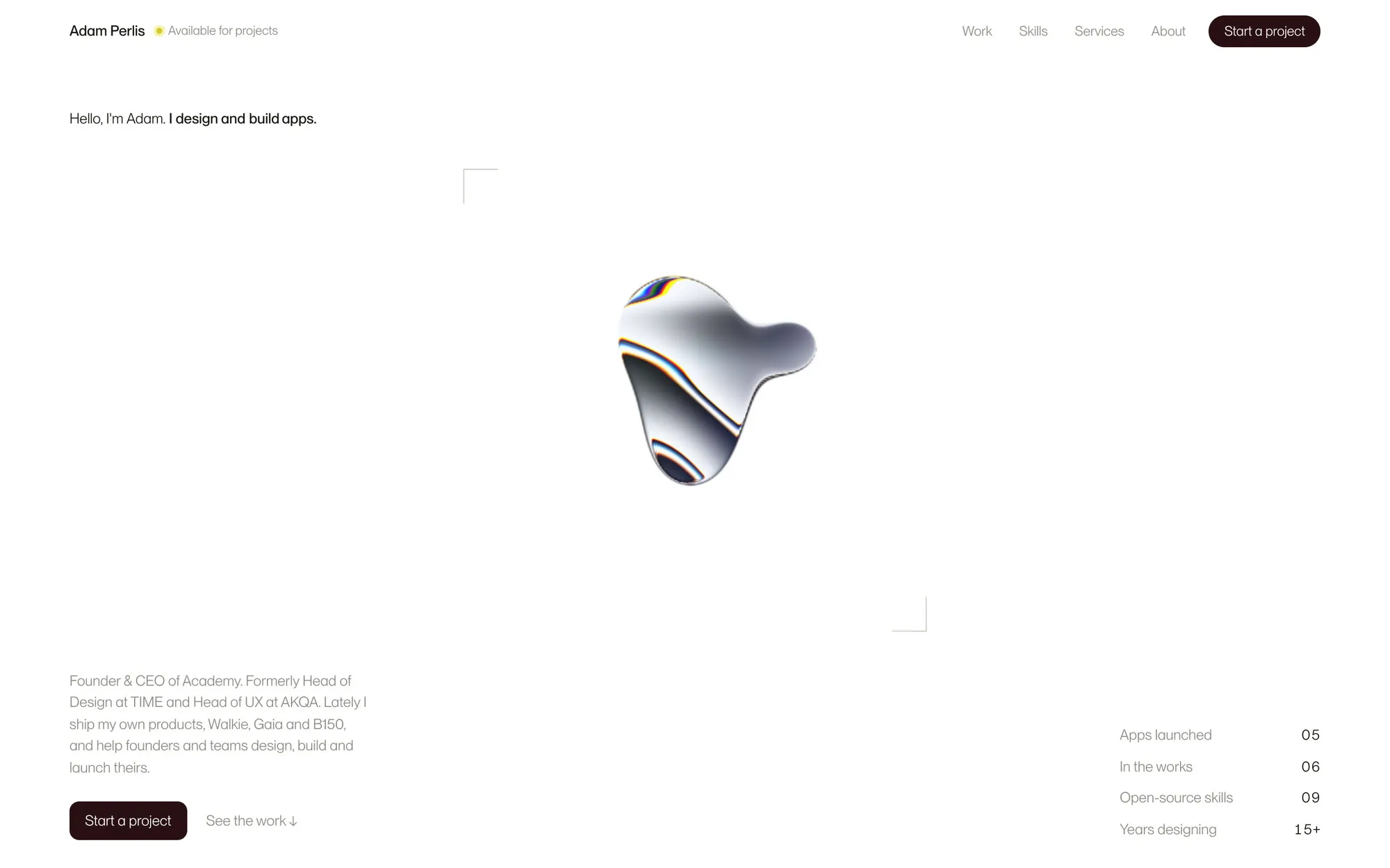
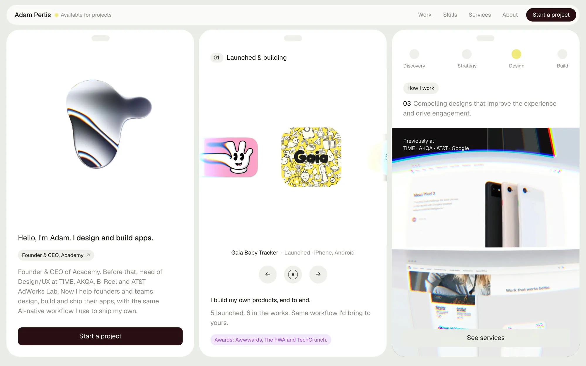
A day and a half later I did it again, harder. I sent a screenshot of a site I liked and said:
Minimalism to make it special. Let’s do that with ours.
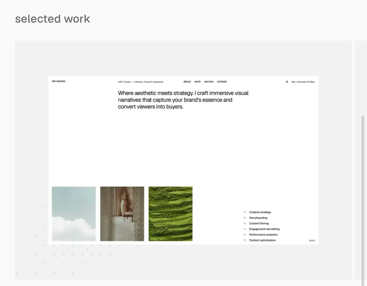
That pass left one primary action per screen, cards with no borders, every screenshot on the same gray mat, and a header that’s just a small pill. Most of the work was taking things out. The mat came from a screenshot I sent of someone else’s portfolio:
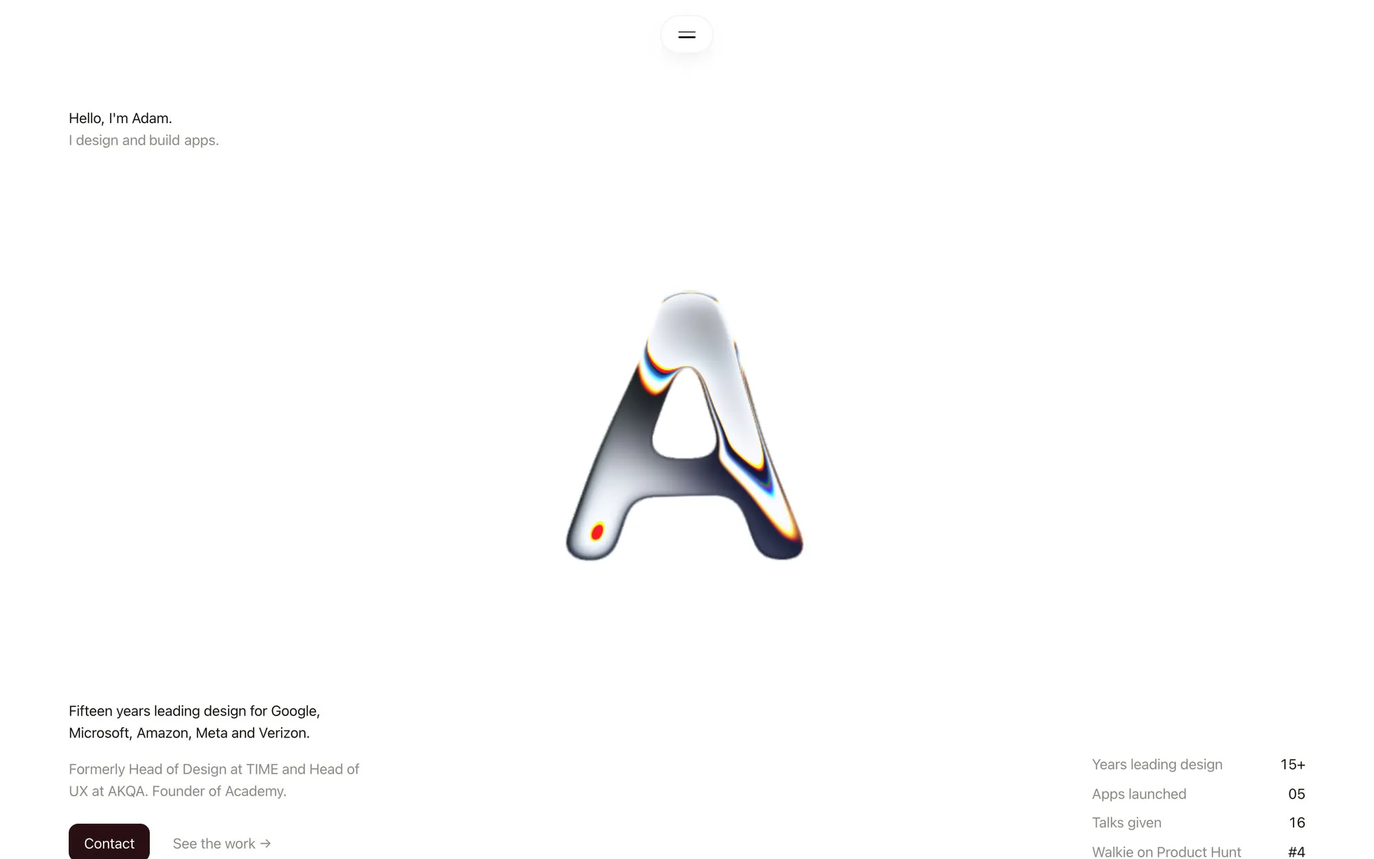
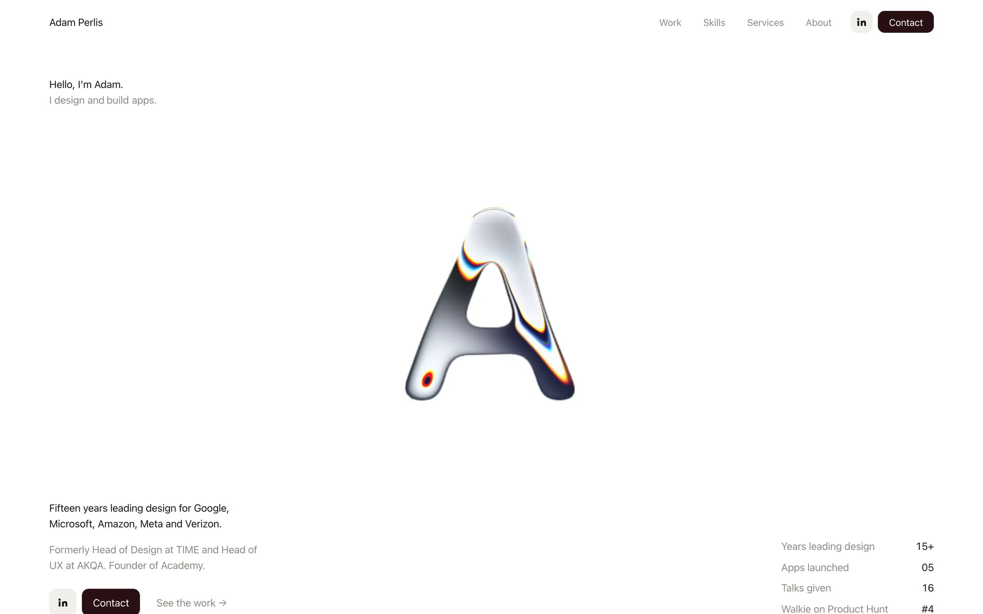
One material, travelling down the page
I wanted Paper’s liquid metal shader somewhere on the site. It ended up everywhere. The first big idea was to stop putting it inside the terminal and make it the terminal:
Instead of the A and neon-like application thing animating, maybe just like make the entire like NPX window be that like shader color and have the type on top of it
Then it had to morph between shapes: the A, an app icon, the Claude Code mascot, a >_ prompt. This is where I was hardest to please.
The morph still looks terrible.
It took three rebuilds. First the shapes swelled into each other, then they used blurred masks as a rough distance field, and finally each shape got a real signed distance field, computed ahead of time so the browser does no work at load. Each version was visibly better. Only the last was right.
Then I asked for something I’d seen as a kid:
For this part I want to have the Liquid Metal turn into a dot that bounces word to word like one of those old animations.
A sing-along ball now bounces across the line of my clients, one line at a time, then drops onto the dial below and becomes the knob on its needle. By then I thought of the metal as one material handed along the page: a shape in the hero, an app icon, a ball, a knob.
Plenty, and it was cheap
A whole day of page transitions: a glass one, a lens, a “portal jump”. Each broke in a different browser. Safari stops animation frames during a view transition, Chrome redrew both pages every frame, and WebKit drops blur on masked layers. After the fourth rewrite:
I want you to get rid of our page transitions entirely
One commit, gone. So were a “How I work” section (“the UX is shit,” I said, and meant it), an editorial serif after five rounds, a metal footer, and a version of the guide that lived in a chat dock. Throwing work away was cheap for two reasons. Every idea existed on the real page before I judged it, and git kept everything I let go of.
A guide, not a chatbot
On the third morning I asked Claude for a little bot icon, after the alien kid in David O’Reilly’s Her. It was a side project. I looked at it and saw the site’s guide.
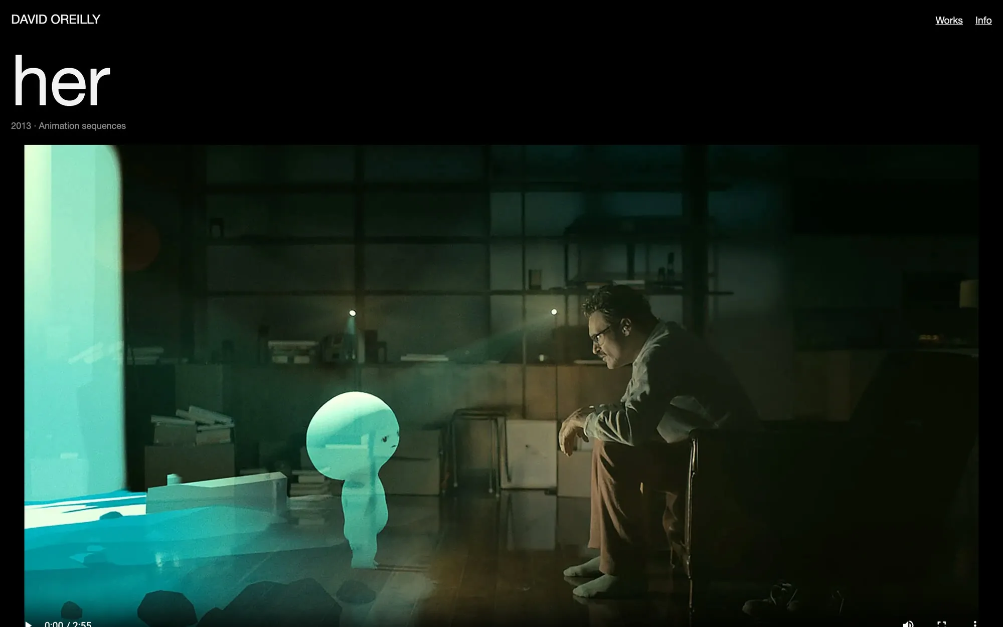
I like to develop a concept and I want you to think about the storytelling here where this little character that we’ve built is a bot and the bot helps. Tell our story and guide the user through the experience.
His first life was Perl, a chat dock with lettered options and an ask box, built on a separate branch so the real site stayed safe. Its thinking shimmer and option cards came from patterns on aicss.dev. It worked, and it felt like every other AI widget on the internet.

I want to lose the idea of it as a separate chat bot but as an interstitial piece of UI on the site that helps do the storytelling. Moving around from place to place.
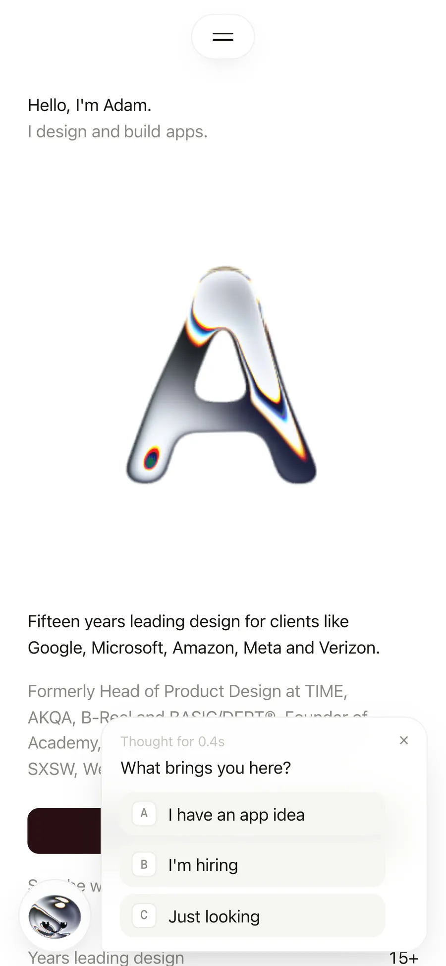
Perld70b5d3
Buddy2826364
So he became Buddy: a chrome head that flies to a seat each section reserves for him, says one line, and moves on when you do. He never covers anything. Then I wanted him born, not placed:
For the buddy experience in the hero let’s remove the current loop of like Codex and Claude and the A and instead have the terminal morph into buddy
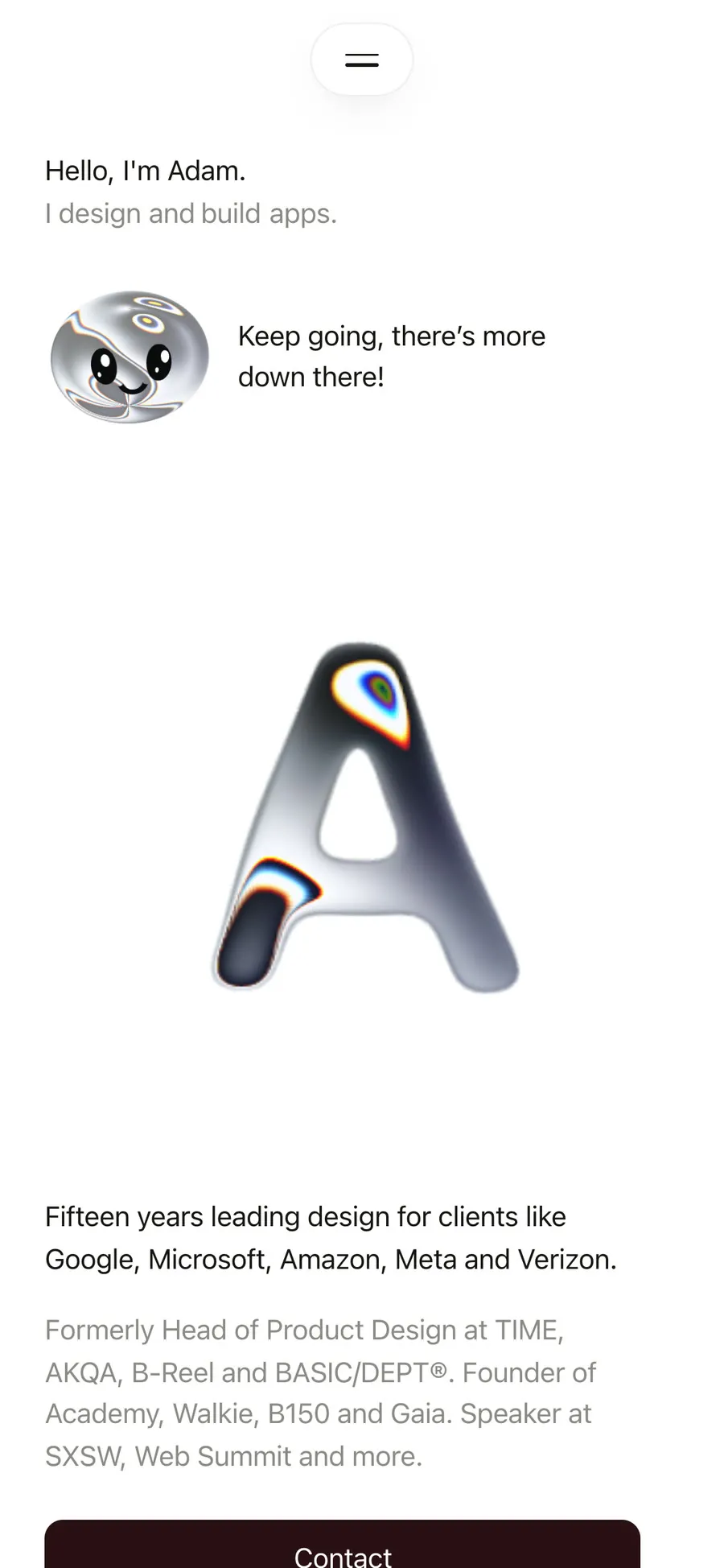
Before80d3138
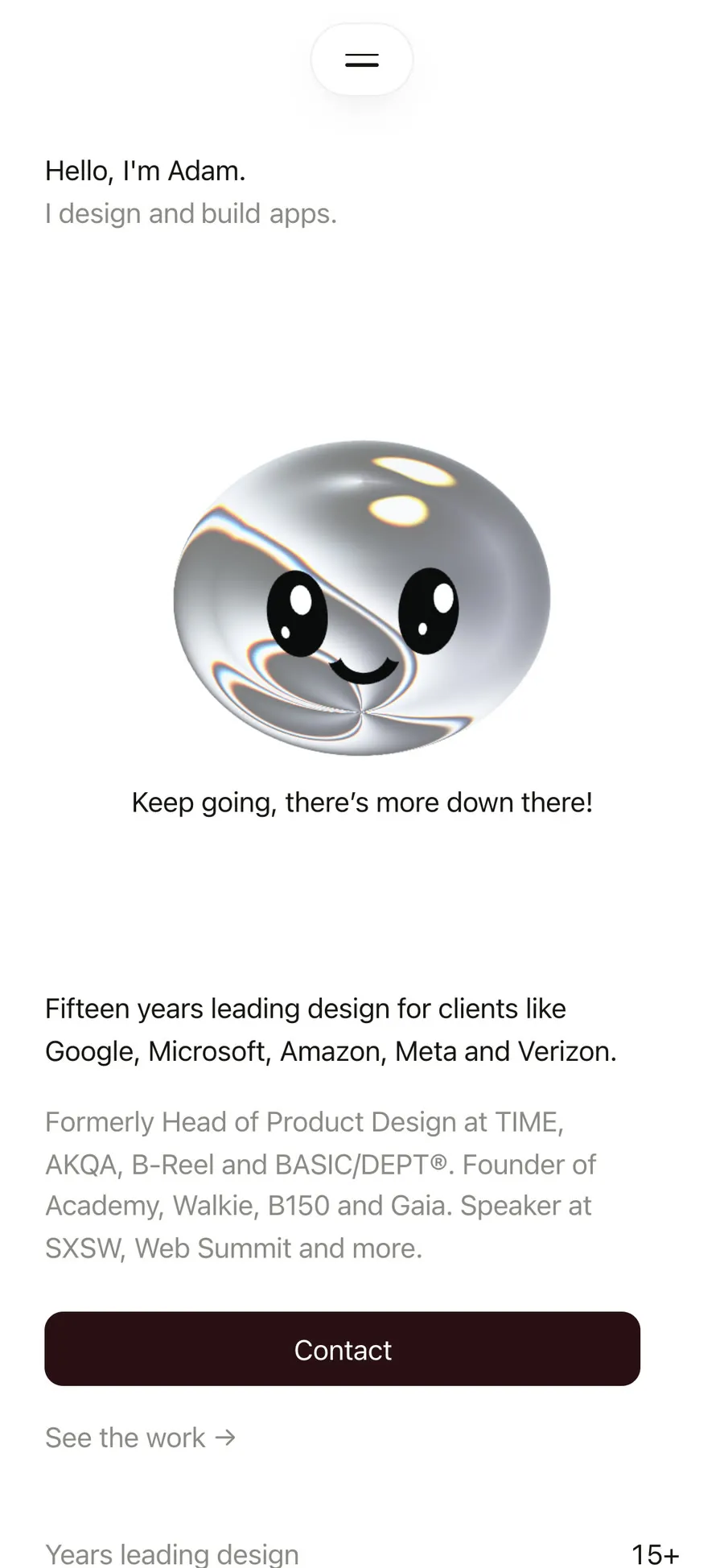
After6223192
A few hours of work on his flight and his seats later:
I think the Buddy version is the winner for this site, let’s roll with this
And he went live.
His voice took longer than his face
Sixty voices went through a lab with sliders for rasp and grit. Then a voice called Garry. Then:
Buddy could speak a bit faster, I think. Should be funny and have character in his voice. Think like how John Oliver would talk
I didn’t want an impression of anyone, so it became a register instead: British, dry and quick. A voice called Edmund, every line rewritten. Claude recorded three deliveries of the same lines, A, B and C, and I picked with my ears:
Go with C, the flatter deadpan. Re-record every line that way.
The jokes were the hardest part. “I have notes” didn’t land. “Psst” came out of the voice garbled, so he says “Ahem”. The clients line was rewritten twice. When a joke didn’t work, Claude didn’t defend it, it wrote a new one. Tap him now and he spins into an outfit: black tie, shades and headphones, a hard hat, or nothing at all. (“Naked again. Don’t look. It’s all head, all the way down.”) You can take him apart on the Playground.
Six cuts, and the most useful bad message I sent
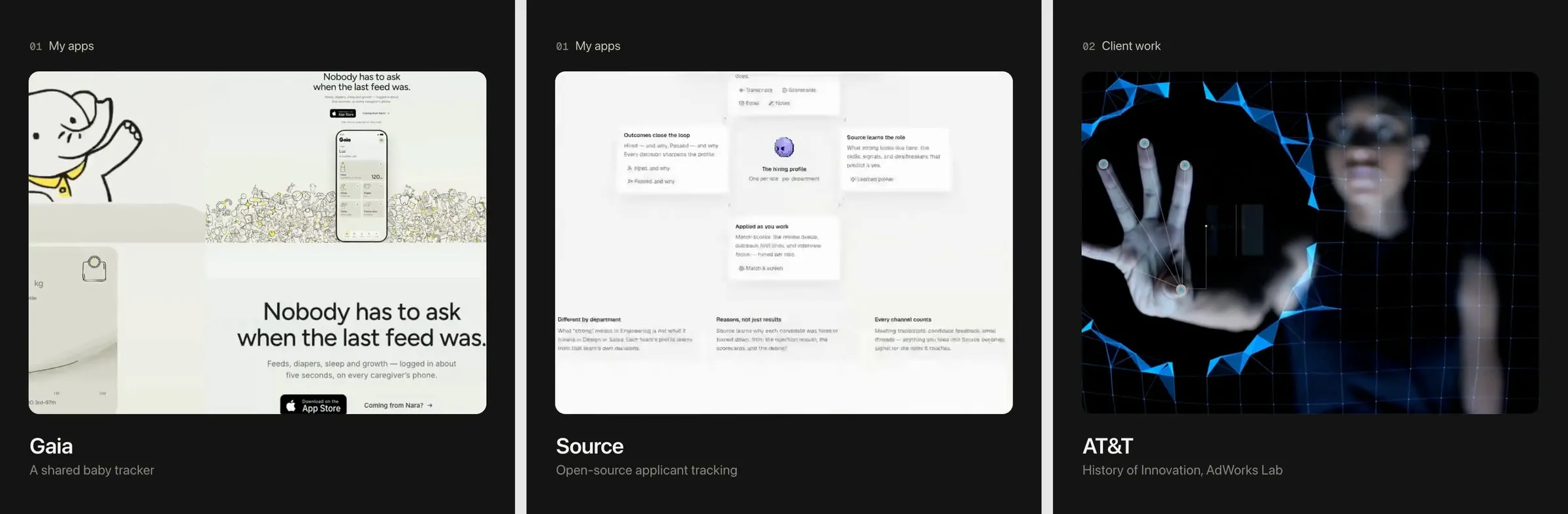
The home page has a silent reel of my apps in motion. The first cut explained itself with labels and counters. I sent Claude a reel I loved and told it to study it:
Then I added the rule that stuck:
The reel shouldn’t have labels, just use the UI, motion, layout, animation
The third cut went backwards. Claude had asked another agent to review the reel, the reviewer called my reference “too fast”, and the cut followed the reviewer. So:
The motion reel you created sucks and it’s nothing like the example I gave.
Fair, and useful. The lesson I wrote down: my reference beats anyone’s taste, including another model’s. For the fourth cut, Claude built a tool that films a live website one frame at a time on a fake clock, so nothing stutters, then cut the reel as a timeline at 90 beats a minute and rendered it in 4K. That one shipped.
And then, looking at it on a big screen:
i think you should recut the video. it doesn’t really look 4K quality wise. and like why not just use code to build these. seems like you’re like recording them?
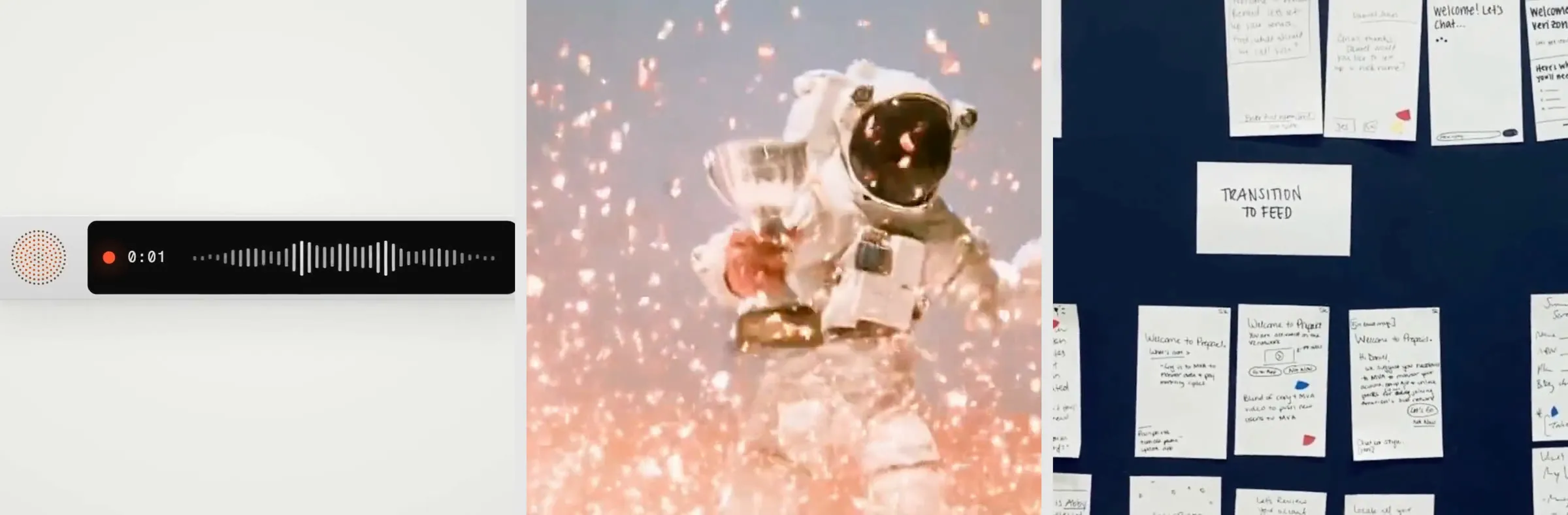
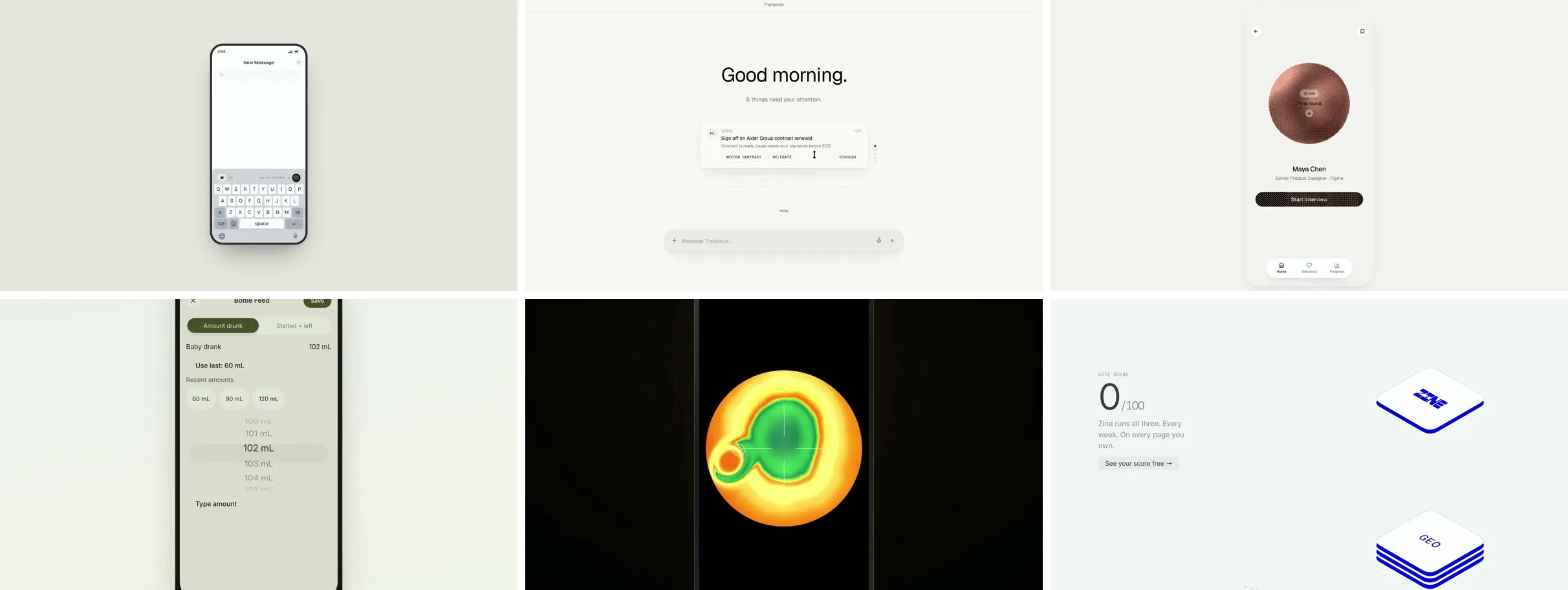
So the fifth cut is built, not filmed. Each of my apps is rebuilt as a scene in HTML from its own code, animated and rendered at a true 3840 by 2160. The first version played like eight product demos in a row. “The pace of this video is like way too slow,” I said. “We just really want to feature really cool UI moments.”
That became a 40-second montage: thirteen moments of about three seconds each, from Walkie’s keyboard to B150’s hero.
It still played like a slideshow. I sent Metalab’s showreel, listed the moments I wanted (the astronaut floating on Transistor’s loading screen, Walkie’s call orb, Gaia’s characters), and ended with:
There are tons… needs to be a faster-paced reel with more cuts.
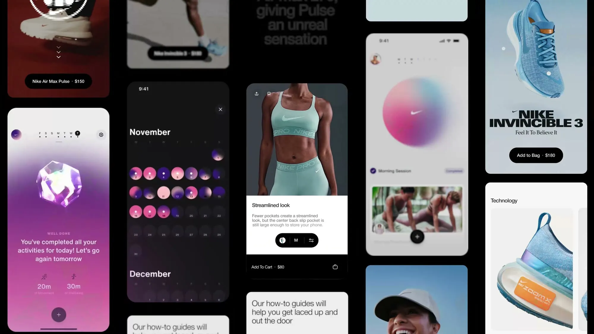
The sixth cut is a showreel in that grammar. Each product opens on its own logo card (Walkie’s end tag, Transistor’s loader, B150’s glyph scrambling in), then runs three or four moments of about a second, cut on the action. Every scene is still code, and any scene can be mounted inside another, set in a phone frame and kept running, so the interface inside a frame is live.
The grids were the hard part. The first ones were a tilted wall of cropped screens with crossfades in and out, and I said so:
All the scenes with the grids of items seem to be really bad and have horrible transitions.
Really study the reel that I sent you earlier and how they do grids.
Claude went back to Metalab’s reel at eight frames a second and wrote down what its grids do: flat and square to the frame, bleeding off every side, never a random crop, entered by pulling back out of a shot that turns out to be one tile. Then I sent a screenshot of the look I wanted, a white page of grey rounded tiles, each holding one small piece of interface:
I want the grids looking like this, if possible.
Now every tile is one piece of one product on its own, still running: Walkie’s cassette turning, Gaia’s sleep timer with the rabbit waving on top of it, Clicker’s thermal disc, Zine’s score counting up. Each one is measured and centred in its tile, after I pointed out that a few weren’t. And one last ask:
Can the end make sure it loops perfectly to the beginning?
The film closes by pulling back out of its last shot into the gallery, and opens by pushing into the gallery’s centre tile. Both halves now run on one clock, and every shot is a whole number of frames, so the last frame steps into the first like any other frame. That’s the one on the home page.
The prompt I’d send now
Six cuts taught me what to ask for. If I started the reel again, this is the one message I’d send, with everything the cuts got wrong already in it:
Make a silent showreel of my apps for the home page of my site: 16:9, about a minute, 4K, and looping.
Build it, don’t film it. Rebuild each app’s interface in HTML and CSS from its own code, with its real colours, type, copy and assets. Draw it on a 1920 × 1080 stage at twice the size, for a true 3840 × 2160. No screen recordings.
Make every frame depend only on time: seeded randomness, videos sought to the frame, shaders on the film’s clock. Render it one frame at a time, so nothing stutters and any frame can be checked on its own.
My reference is Metalab’s showreel (metalab.com/what-we-do). Study it frame by frame before you cut anything, and write down what it does: shot lengths, how each brand’s run is built, how its grids move. Measure the cut against it. If a reviewer, or you, disagrees with the reference, the reference wins.
Use its grammar. Each product opens on a logo card in its own real mark and motion, then three or four of its best UI moments, about a second each, cut on the action. Moments, not product demos. Designed arrivals between products, hard cuts inside one, no crossfade zooms. No titles, labels or captions: only the products’ own UI, and every shot moves.
Any scene can sit inside another, in a phone or browser frame or on a brand-coloured ground, and keep playing.
Grids are galleries: a white page of light grey rounded tiles bleeding off every side, one live component per tile, centred on what it actually draws. Enter a grid by pulling back out of a full-frame shot that turns out to be its centre tile.
Make it loop with no seam: the close and the open on one clock, every shot a whole number of frames, so the last frame runs into the first.
Show me 4K stills at each beat and a quick preview before the full render, and check the encoded file, not the source. Stay under 16 WebGL contexts. Fit the 4K file under 25 MiB for Cloudflare Pages, add 1080p and 720p versions, and use frame 0 as the poster.
Screenshots are the best bug reports
Most of my bug reports were a screenshot and a sentence. Almost every one exposed a real bug rather than a matter of taste.
the nav UI is still not moved down and inset in the open overlay menu like discussed
“Still” was the word that mattered. The fix had shipped a few hours earlier and never run on any screen: the animation library leaves an inline style on the header, and that beats the CSS class. Claude moved the header with the animation library instead.


Then “it kinda stutters.” Instead of guessing, Claude measured. Frame times were fine, so the problem was the motion itself. The menu’s items moved down and then back up, the panel grew from the wrong corner, and it was redrawn every frame. Dropped frames went from 2 in 3 open-and-close cycles to 3 in 15.
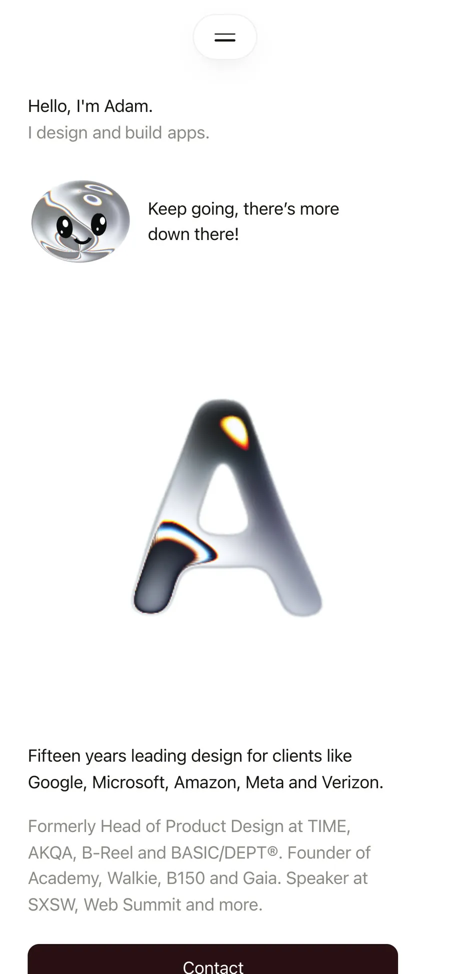
Small things got the same treatment. I asked for my portrait next to my hello, and for Buddy on the other side of his line:
maybe move buddy to the right side of the text on this one.
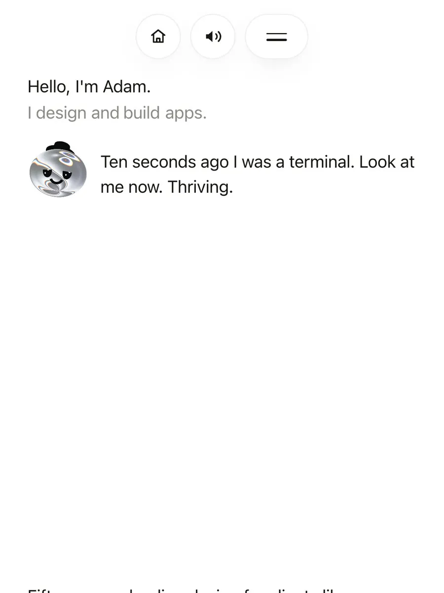
Before204ae53
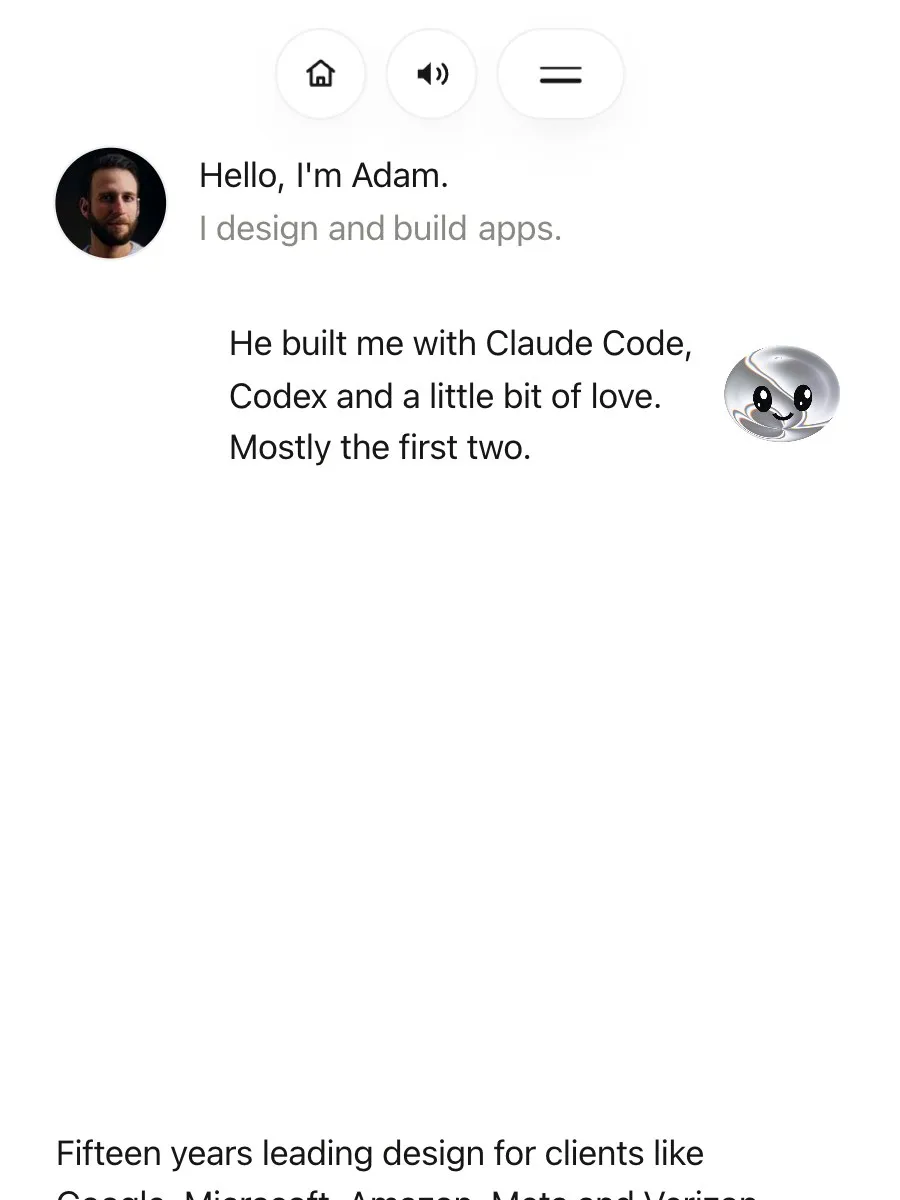
Now7ce5bdd
A day later, looking at the same screen:
can you indent Buddy’s text a bit? i want it to feel a bit like an LLM chat
So his line now sits in from my hello, the way a reply does in a chat. The same morning the menu’s links got smaller on phones, so all eight fit without scrolling.
The case studies, done properly
With the site standing, I went back to the part people actually read:
i need you to go through each case study and make sure you chose amazing shots of each experience to share and wrote thorough case studies
Every case study got new shots, about 120 in all, taken from the real thing wherever it existed. Titan was captured from the game itself at a true 4K. Source came from its hosted demo, Transistor from its built-in demo mode in all four themes, and B150 from its live pages. Clicker got its first real screenshots anywhere, from the iPhone simulator. Each shot now sits next to the paragraph it proves, instead of in a pile at the end.
The writing follows the structure from my own leadership guide: my role, the decisions and trade-offs, and a timeline. It also got more honest. Each case study now credits what it’s built on: Walkie began as a fork of Handy, Camcorder is built on OpenScreen, Titan on False Earth, and Open Tributary’s flow field is adapted from ThreeUI. Each says how much of it was written with Claude Code, counted from the repo’s commits. Checking every claim against the code found things I’d got wrong, like Source’s pipeline, which is a table, not a board.
Then the part I’d skipped: leadership
A portfolio of apps I built myself reads as a builder’s. So the About page gained a section on leading teams (35 people at AKQA, about six at TIME, and lately small teams that work in code) and one on how I design AI products, down to the ethics and the tools. Three leadership case studies are drafted from my old decks and site, and they wait on numbers only I have before they go live. Claude got one thing wrong along the way, and I said so:
I didn’t work at Verizon. I worked on that account for AKQA. Same at Google for BASIC/DEPT®.
And there’s a Playground now: you can take Buddy apart on sliders, smear Clicker’s thermal field, read its rainbow text, and listen in on Walkie’s call orb.
What actually made the difference
- Show it, don’t describe it, then make it yours. A reel, a screenshot or a live site carried more than any adjective, and none of them was copied. “Like one of those old animations” solved the hardest part of the bouncing ball in seven words.
- Say no fast. One line is enough. “sucks” with a reference attached got me the best reel; a polite paragraph would have got me a slightly better bad one.
- Ask what it missed. “What haven’t you done that you were supposed to do” turned up dropped requests more than once.
- Make it measure. The menu stutter, the hero fit, the reel’s rhythm, the seam where it loops: every fix that stuck started with a number.
- Choose with your eyes and ears. Asking for options (three deliveries, four voices) beat describing what I wanted.
- Keep a copy to go back to. Big ideas went on a branch with their own preview link, so the live site never broke while I made up my mind.
- Write the rules down. A short rules file holds the things it must never do: deploy as a Worker, commit a secret, print a key. It also holds the things it always does, like keeping the build log.
- Test on the real thing. The iPhone Simulator found Safari bugs that desktop Chrome hid, and my own phone found the rest.
The skills it leaned on
Claude Code skills are instructions it loads for a kind of job. These did real work here:
- 12 Principles of Animation
- reviewed the morph, the hero flare, Buddy and the menu against Disney’s principles, as checkable rules
- watch
- pulled frames from the reference reels so they could be measured
- GSAP
- rebuilt the menu’s open and close
- Cinematic GSAP + Lenis motion system
- a reference for the scroll and reveal motion
- Full-stack coding
- its loop: no type errors, every page loads clean, before saying done
- Feature video
- filmed my apps for the case studies
It also ran helpers in parallel: agents that wrote the first drafts of the case studies from my repos, scouted footage, reviewed the reel, and read this log back so I could write this page.
A static site with a lot going on
Every page is prerendered. There’s no server and no framework running in your browser; the motion is written by hand.
- Astro 7
- the site, fully static, with the case studies as content
- Tailwind CSS 4
- every style, with the colours and type as tokens in one file
- GSAP and Lenis
- all of the motion, on one clock, and the smooth scroll
- Three.js
- Buddy’s head, eyes, mouth and outfits
- Paper Shaders
- the liquid metal: the terminal, the A, Buddy’s chrome
- Speechify
- Buddy’s voice, recorded ahead of time with word timings
- Web Audio
- the key clicks and blips, synthesised, and the voice lab
- Playwright
- tests, screenshots, and drawing the reel one frame at a time
- ffmpeg
- the reel, encoded at 4K, 1080 and 720
- Cloudflare Pages
- hosting;
npm run deployand it’s live - DialKit
- the sliders on the Playground
The code is about 8,200 lines, plus scripts for the voice, the captures and the reel.
The recipe, as I’d do it again
- Write the one line first. What should the site get you? Mine was “approach me about consulting and helping them build their apps.” Every later call checks against it.
- Bring references. Two or three reels or sites you love. Ask for them to be studied frame by frame, not summarised, and treat them as a starting point, not a template.
- Start the log on day one, with your prompts word for word. You’ll want it.
- Pick a boring, static stack. Astro and Tailwind on Cloudflare Pages took no thought, so the thought went into the work.
- Build the system before the screens: colours, type and spacing as tokens, one way to show a screenshot, one primary action.
- Put one signature thing in. Mine is the liquid metal and Buddy. Let it carry the site, and keep everything around it quiet.
- Ship on day one, then look at it on your phone every few hours. Send screenshots.
- Throw things away. If it fights three browsers, it goes.
- Sweat the words. Read every line out loud. If a joke needs explaining, write a new joke.
- Measure before you fix, and keep your reference above everyone’s opinion, including the AI’s.
- Build the video, don’t film it. Rebuilt in code, every frame is drawn at full size from the product’s own design, so it’s sharp at 4K, never stutters, and can be re-cut in minutes.
This page went through the same loop
When the site felt finished, I asked for the write-up the log had been kept for:
now that we completed our journey, i want you to do a full write-up and like tutorial of how we built this site…
The first draft came back as a long document full of tables, and it said “we”. Two quick corrections:
HOW I BUILT, NOT WE
this article needs to feel more human and like not be so robotic. let’s use images, layout, typography and pull all this together as a page on the actual site
So it became this page, with my messages as I sent them and the old versions of the site rebuilt from git. Then I caught it opening in the wrong place (it began with the reels, not my first message), asked for my typos to be fixed, and asked to see the references themselves. Same loop as everything else: it makes something, I look at it on my phone, I say what’s wrong in a line.
Standing on these
- @basit_designs’ reels ↗ the first reference for the look and motion
- edo_lunardi’s reel ↗ the reference the early cuts of my reel were measured against
- Metalab’s showreel ↗ the grammar of the sixth cut, and how its grids work
- liquid-glass-carousel ↗ by Yousuf-developer, ported into the site’s carousels (MIT)
- Paper’s liquid metal ↗ the shader behind the terminal, the A and Buddy’s chrome
- David O’Reilly’s Her ↗ the character Buddy started from
- aicss.dev ↗ patterns for Buddy’s first, chat-shaped life
- DialKit ↗ by Josh Puckett, the sliders on the Playground
- jib.design ↗ the gray mat every screenshot sits on
- Olga Dyakova at Academy, whose leadership portfolio guide shaped the About page
- Peter Bagi took my portrait
Built with Claude Code. The code is on GitHub ↗.